Criterion A: 5, I think that i referenced the text not just in the passage but as a whole pretty well.
Criterion B: 4, I think I talked about literary devices but didn't focus enough on the effects of them
Criterion C: 2, I think that I talked about important aspects but as a whole when I started talking and got nervous became unorganized.
Criterion D: 3, I think that I used good vocabulary to discuss the passage and the novel but I think I could've used more advanced language to strengthen the commentary.
I emailed my recording to Mrs. Genesky, I couldn't find a way to attach to my blog post.
Sunday, February 21, 2016
Sunday, February 7, 2016
Never Let Me Go Cover Examination
Cover 1: A attractive young female is the eye catcher of this cover. The woman looks sad about something which might imply the plot of the story before reading. She is sitting in a forest which could provide any idea about the setting for the novel. The cover also includes an award that the novel received and a quote from New York Times about the novel. I think that the illustrator of this cover designed it this way to attract people to read the novel. It creates an mysterious idea that could make readers want to discover what the novel is about. By providing the awards and the quote it shows readers that the novel is very respected and a good read and could make readers want to read it more.
Cover 2: The second cover also creates a mysterious feeling. The image of a girl that seems to be fading away is revealing of what could be an interesting story. It hints to the title of Never Let Me Go, it makes it seem like the girl is going away and someone doesn't want to let her go. It could hint to the plot of the story and that there could be an aspect of love in the story. The illustrator also places the title and author in the direct middle of the cover to attract readers. They also included other novels by Ishiguro to attract readers of those novels to read Never Let Me Go.
Cover 3: This cover's main image is of a boat tied to a pole. The background of the image is very calm and gloomy which could be revealing of the plot of the story. The idea of the boat being tied up hints to the title of the novel and that if the boat wasn't tied to the pole it would be let go and it's the pole's job to never let the boat go. This cover also includes awards the book received and a quote from Time to attract readers and show the quality of the novel
Cover 4: The main image of this cover is the insides of a human body. This cover is the most revealing of the four of the plot of the story. This image is very useful in creating an interest to learn more about the novel and read it. It would be hard for a person to determine the plot of the novel from the title alone but the image helps create the ability for people to somewhat learn about the plot. By not providing to much information about the plot with the image it creates want in readers to read more. The illustrator of this cover did not include anything about the awards or any quotes and used the image as the main attraction of the cover.

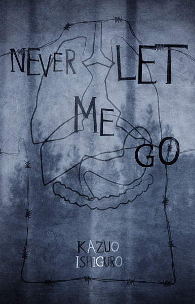
These covers differ greatly and if I had never read the novel would have created completely different ideas about what the novel would have been about. The first cover of the girl fading away would create the idea that the story would most likely be about the relationship of a girl and a boy and the struggles they go through but end up never letting go of each other, which is also helped by the title. It would have been difficult for me to try and determine what the possible plot would have been with the second cover. With the image of the inside of a human body it would have been hard to try and pinpoint what would be the focus of the story. But with after reading the novel I can see how both covers are illustrated the way they are. The creators of each wanted to focus on different aspects of the novel and were willing to rely on the fact that both would be appealing to readers and make them want to read the novel. If I had to chose a cover that I think did a better job of creating an image for the novel I would chose the second cover but I think that both focus on very important aspects of the novel and are important to the plot. I think that the first one would attract certain readers that like to read more about romance and the second would appeal more to those who are curious due to the mysterious idea presented on the cover.
Cover 2: The second cover also creates a mysterious feeling. The image of a girl that seems to be fading away is revealing of what could be an interesting story. It hints to the title of Never Let Me Go, it makes it seem like the girl is going away and someone doesn't want to let her go. It could hint to the plot of the story and that there could be an aspect of love in the story. The illustrator also places the title and author in the direct middle of the cover to attract readers. They also included other novels by Ishiguro to attract readers of those novels to read Never Let Me Go.
Cover 3: This cover's main image is of a boat tied to a pole. The background of the image is very calm and gloomy which could be revealing of the plot of the story. The idea of the boat being tied up hints to the title of the novel and that if the boat wasn't tied to the pole it would be let go and it's the pole's job to never let the boat go. This cover also includes awards the book received and a quote from Time to attract readers and show the quality of the novel
Cover 4: The main image of this cover is the insides of a human body. This cover is the most revealing of the four of the plot of the story. This image is very useful in creating an interest to learn more about the novel and read it. It would be hard for a person to determine the plot of the novel from the title alone but the image helps create the ability for people to somewhat learn about the plot. By not providing to much information about the plot with the image it creates want in readers to read more. The illustrator of this cover did not include anything about the awards or any quotes and used the image as the main attraction of the cover.
These covers differ greatly and if I had never read the novel would have created completely different ideas about what the novel would have been about. The first cover of the girl fading away would create the idea that the story would most likely be about the relationship of a girl and a boy and the struggles they go through but end up never letting go of each other, which is also helped by the title. It would have been difficult for me to try and determine what the possible plot would have been with the second cover. With the image of the inside of a human body it would have been hard to try and pinpoint what would be the focus of the story. But with after reading the novel I can see how both covers are illustrated the way they are. The creators of each wanted to focus on different aspects of the novel and were willing to rely on the fact that both would be appealing to readers and make them want to read the novel. If I had to chose a cover that I think did a better job of creating an image for the novel I would chose the second cover but I think that both focus on very important aspects of the novel and are important to the plot. I think that the first one would attract certain readers that like to read more about romance and the second would appeal more to those who are curious due to the mysterious idea presented on the cover.
Subscribe to:
Comments (Atom)